For an apartment for a couple and their four children on the Upper East Side in New York City, designer Hilary Matt was tasked with making the nondescript home feel spacious, warm, and inviting. “Our clients had just moved their whole life from a large suburban home in Texas to a New York City apartment, so we wanted to make them as comfortable as possible,” explains the New York City–based designer and founder of Hilary Matt Interiors. “We wanted them to be excited about their new home and overall their move to New York. The whole idea for the apartment was to make it a bright, young fun and fresh space.”
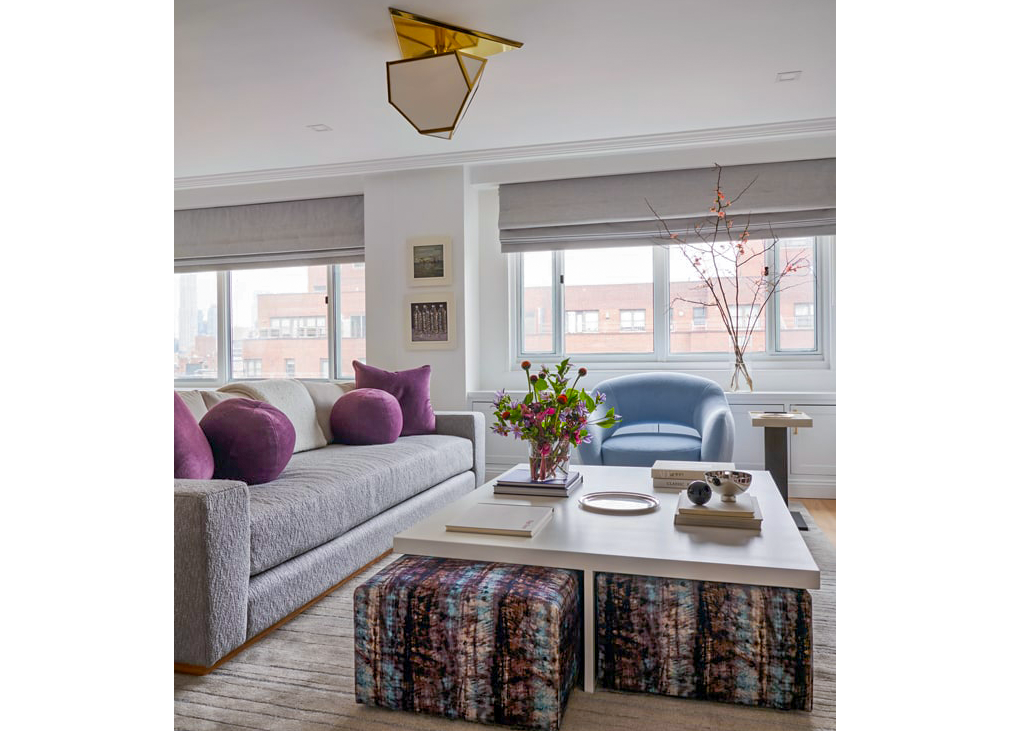
The existing five-bedroom, 3,100-square-foot apartment, however, lacked character, personality, and dimension. So, Matt and her team spent the next year-and-a-half on the overhaul replete with multi-functional spaces and ample storage.”The clients have four kids, so wanting to make them happy with each of their bedrooms was really important to the job,” explains Matt. “Another major goal was to create as much space and storage as possible.”
In the kitchen, Matt made simple updates like tile, fabrics, light fixtures, and hardware to create a new look. She added Crescent light pendants from Lee Broom, “Bacco” counter stools from Design Within Reach, and a mosaic marble tile from Studium for the backsplash.
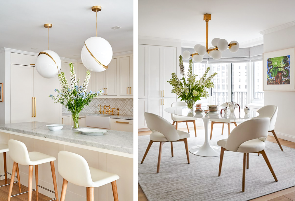
“For the dining room they wanted a space that could be dressy and casual all at the same time,” explains Matt. “A very multi-functional design.”
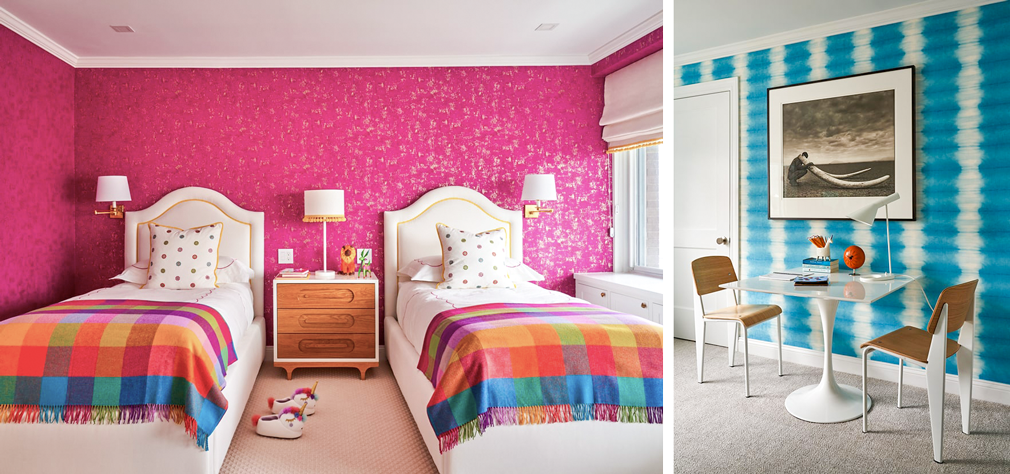
To create more space and functionality for the family, Matt closed off a space between two columns to create a pantry, and added hidden closets throughout the hallway to the bedrooms for additional storage. Each bedroom was completely customized for both the children and the parents. “It was very important for the two girls’ bedrooms to be a fun space that they each could call their own,” says Matt. “One girl wanted turquoise, and the other girls wanted pink, so with that information, we took it from there.”
“For the primary bedroom, the client wanted something feminine, soft and young,” explains Matt, of the room lined with an upholstered bed by Holly Hunt, hanging pendant lamps by Trueing, and a vintage sofa by Fritz Hansen. “She always knew she wanted a pink bed so we started with that. Also part of the reason we loved the sofa there, is because of texture and fabric which we found early on and knew would be a focal point in the room.”
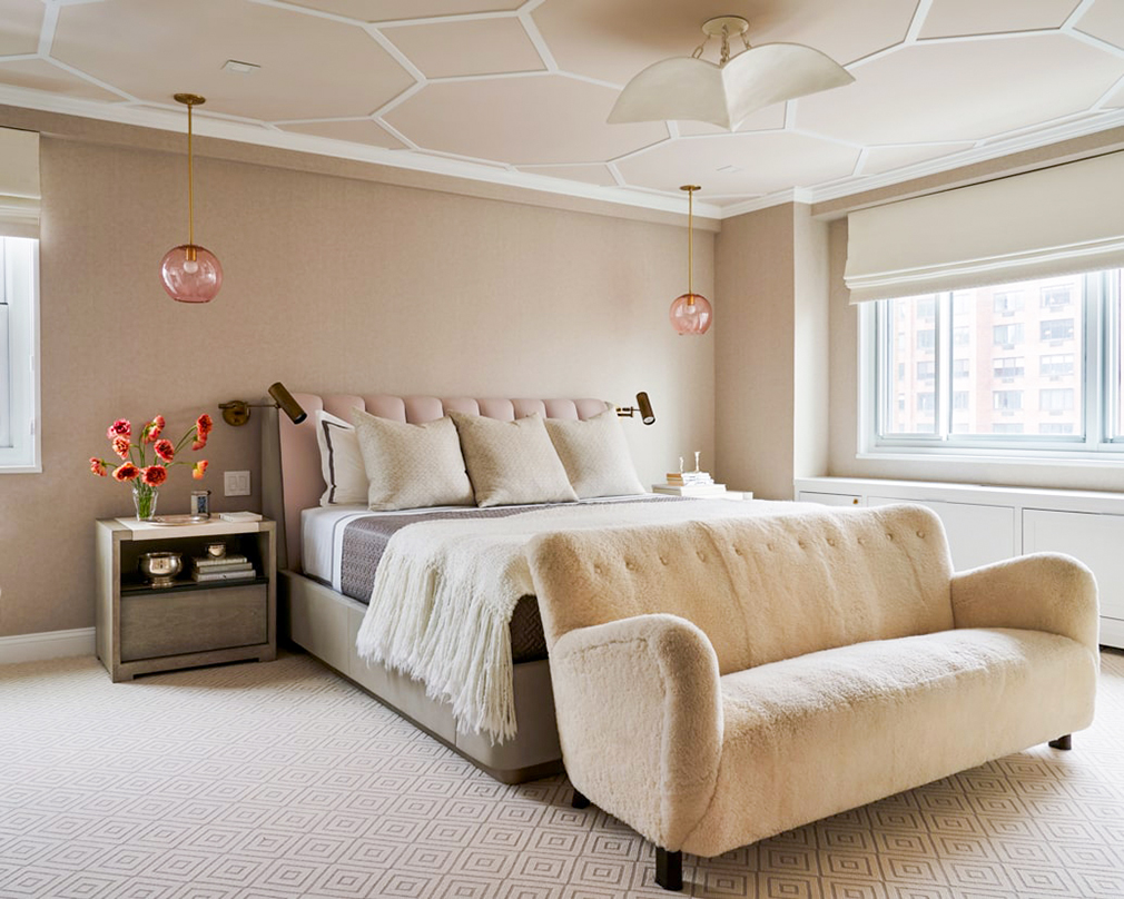
“My favorite part was that there were four kids, and we got to be playful and unique for each bedroom which is not something that every project allows for,” says Matt. “My favorite room is the Master bedroom. We used beautiful pieces and fixtures and made the room serene and luxurious. This project made me realize that not much construction needs to be done to make a house into your own space. We really transformed this apartment by making small tweaks to fit this family’s lifestyle.”
Matt’s Design Ground Rules
Consider Wear and Tear
“Since the family has four kids we needed to take that into account,” says Matt. “We decided to use an outdoor rug [that looks like it is for indoors] under the dining table for durability purposes. We also used an outdoor fabric on the sofa to create a family-friendly space.”
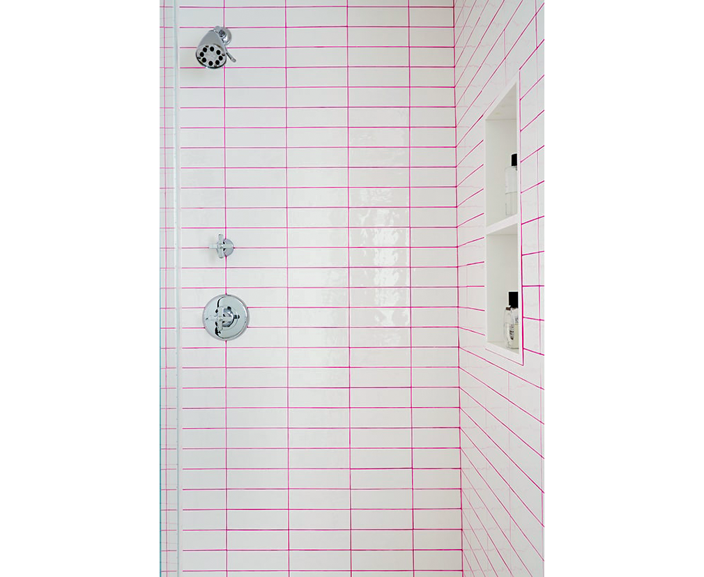
Use Unexpected Color in Unexpected Places
“Pink grout added a fun punch to the girls’ bathroom without breaking the bank.”
Make It Multi-purpose
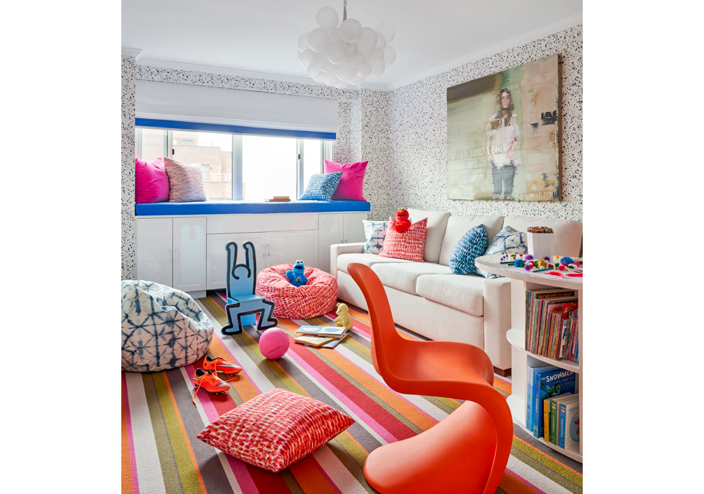
“The sofa in the playroom is a pull-out sofa so it can be used as an extra sleeping space for guests,” explains Matt.
Designate Specific Zones
“We made a small mudroom in the entry as a space for the kids to drop their belongings when they come into the apartment,” says Matt.
Don’t Forget Hardware and Fabrics
“In the kitchen we didn’t do much work,” says Matt. “We swapped out the hardware and light fixtures to give a nice subtle change. We used a vinyl on the counter stools and kitchen chairs to make clean-up easier children.”


