For interior designer and author Shea McGee—who makes up one half of lauded Studio McGee and McGee & Co. with her husband, Syd—design was something innate. “I was always interested in design,” she notes. “One of my favorite childhood memories was going to the Museum of Fine Arts in Houston with my dad. It was free on Thursdays and our family took advantage of that amazing perk. I would wander around the famous works of art with probably more interest than most little kids. Though it was always a passion of mine, I didn’t start to realize that I could or should do it as a career until Syd and I got our first home together.”
Flash forward several years later, and the duo’s career has skyrocketed with a stable of high-profile clients, two design tomes, and numerous partnerships with companies including Target, Kohler, and Ann Sacks. Below, Shea reveals her design beginnings, some preferred pieces from the McGee & Co. collection, and offers up her most valuable design advice culled from the pages of her latest book, “The Art of Home.”
Tell us about your start and your backstory.
Shea McGee: “I studied Communications in college. During a weekend trip to visit my brother at a nearby school, I met his roommate, Syd, whom I would eventually marry. We moved to Southern California, where Syd is from, got a small, one-bedroom apartment together and we both began our careers in our chosen fields. After a while, I started to realize that my true passions were in design and Syd encouraged me to go back to school to study interior design. Meanwhile I started posting my own home renovations on Instagram, a concept that was relatively new at the time. Soon, one client and one room became two and it grew to the point where I stopped going to school and launched my design firm full-time.”
Your first big break in design?
SM: “It was a slow but steady rise, with some peaks and lulls, of course. Syd and I poured everything we had, emotionally and financially, into making it happen, and sometimes looking back it feels like we had to make it happen because there was no other option. We were determined and focused. With that said, there were some momentous events that felt exciting. Our first project: “Modern Mountain Home” featured in Architectural Digest, for instance, or the day we reached 10,000 followers on Instagram.”
Your dream collaboration?
SM: “I’ve been lucky to work with some amazing clients in a variety of dream homes. One project I’ve always wanted to take on outside of that is hospitality design. I’m always open to a hotel design project that suits my aesthetic and lines up with all of the other projects I have going on at the time.”
Tell us about your product line, McGee & Co.
SM: “McGee & Co. was launched eight years ago. I started to see an opening in the industry for pieces that I wanted to use in projects but couldn’t find. I wanted pieces that spoke to Studio McGee’s core aesthetic of Modern Heritage, that were well-made and high quality. Much like Studio McGee’s conception, we started small—a collection of pillows, and scaled up from there. The concept of a slow and steady climb has worked well for us. It has given us time to test out what works best before diving all the way in.”
A few favorite pieces that you love and why?
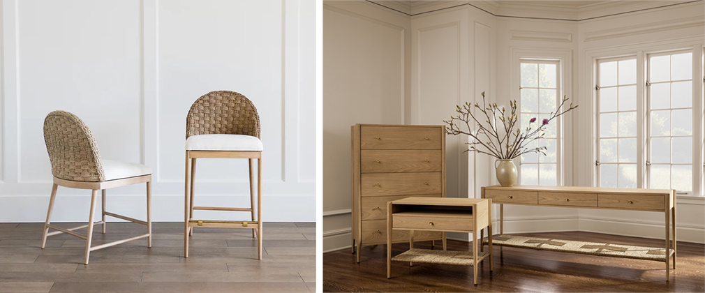
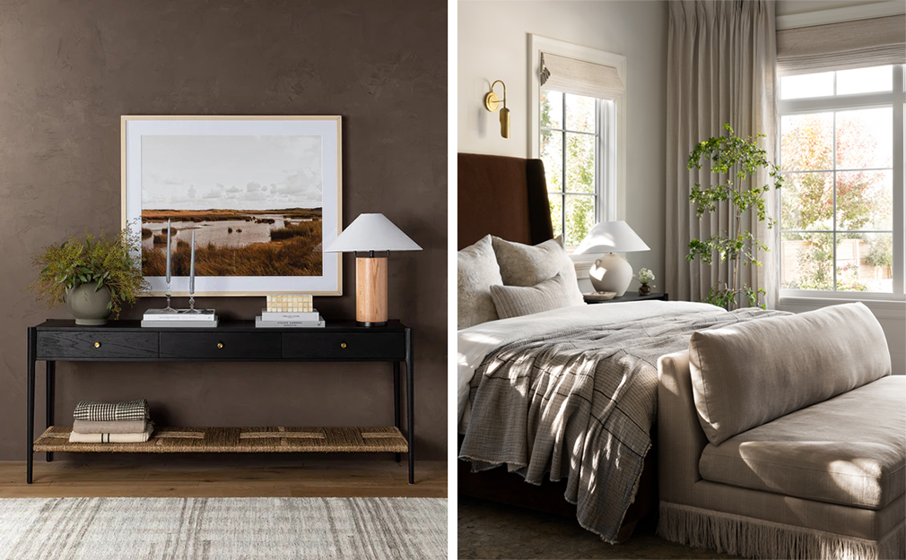
SM: “Currently, one of the pieces I’m loving and have in my own home is the Philippa Settee. It sits at the foot of the bed in our bedroom. It’s oversized and more modern in shape than what you traditionally think of as a settee. There’s a subtle pinstripe in the linen that adds a bit of a masculine feel with its menswear inspired pattern, while the silk fringe is pure femininity. This juxtaposition creates a beautiful tension. A few of our other signature silhouettes that I think define what McGee & Co. is as a homewares brand, is the Molly collection (a dining chair and counter stool with elegant, tapered legs and an intricately woven back) and the Dana collection (a nightstand, dresser, and console table hand crafted out of a stunningly simple light oak).”
What’s up next?
SM: “We have a really exciting collaboration coming out soon with a female-led fashion brand that I really respect. I can’t give the full details now, but I am so excited for the brands’ two audiences to learn more about each other because it’s a similar aesthetic and mindset in two different genres (interior design and fashion). Another forthcoming project I’m excited about showing the world is an expansion of our Morris & Co. collaboration. I’m a huge fan of this time-honored brand and it’s exciting to add five more wallpaper colorways exclusive to McGee & Co. to the lineup.”
Your top 5 design hacks and expert tips?
SM: “I’m always quick to point out that design is subjective, and it should work for you and your lifestyle. With that said, there are a few things that I’ve learned over the last ten years of Studio McGee that I think can be applied to any style of home. Studio McGee was built on a willingness to share sources, paint colors, and brands, and leading with an education-first mindset. I like to show and share so that people can get the Studio McGee look in their own home if they choose to. My book, “The Art of Home,” is basically one big guidebook, taking readers room by room and talking them through the design choices I made in the front of the book, and the back of the book is a collection of straightforward guides.
Here are some of my biggest pieces of advice from the book:
Don’t be scared to pivot.
We all come into design (and life) with a plan, but as it unfolds, in my experience, some of the best decisions came from moments when we had to make a pivot.
The key to balance in design is focusing on counterbalance.
For every rustic piece in a dining room, like an antique buffet or weathered urn, add a sleek choice, like an angular metal side chair or chic glass taper candleholders. A room develops allure when juxtaposed elements sit comfortably together.
Thoughtful design helps elevate even the most routine, everyday experiences.
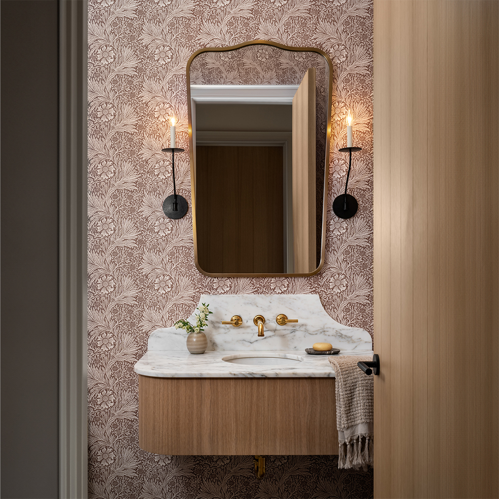
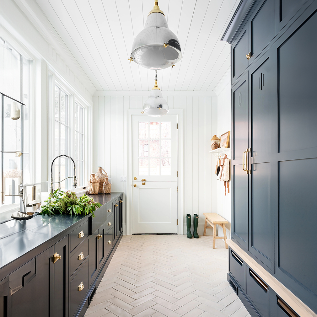
I always encourage clients to take risks and have fun in spaces that are meant mostly for utility, like bathrooms, mudrooms, and laundry rooms. When I was designing my own home, I put a significant amount of thought into where to play it safe and where to take risks. I didn’t want my home to be devoid of personality, but I also didn’t want to rip out all the tile in a few years because trends change, or my own opinion does. I decided to choose classic shapes for big-ticket items like plumbing fixtures and countertops, but push the envelope in smaller spaces like the powder room and kids’ bathroom.
When designing spaces for kids, the goal should be to provide a sense of whimsy and room to grow.
This fulfills a desire for both the kid (whimsy) and the parent. You don’t have to redo the entire room as they age. For example, when the fascination with fire trucks and fairies fades, it’s easy to swap out the artwork and accessories or even repaint the walls, but the bed and dresser are investments that grow with the child.
Consider the way the light touches the home and embrace it as art.
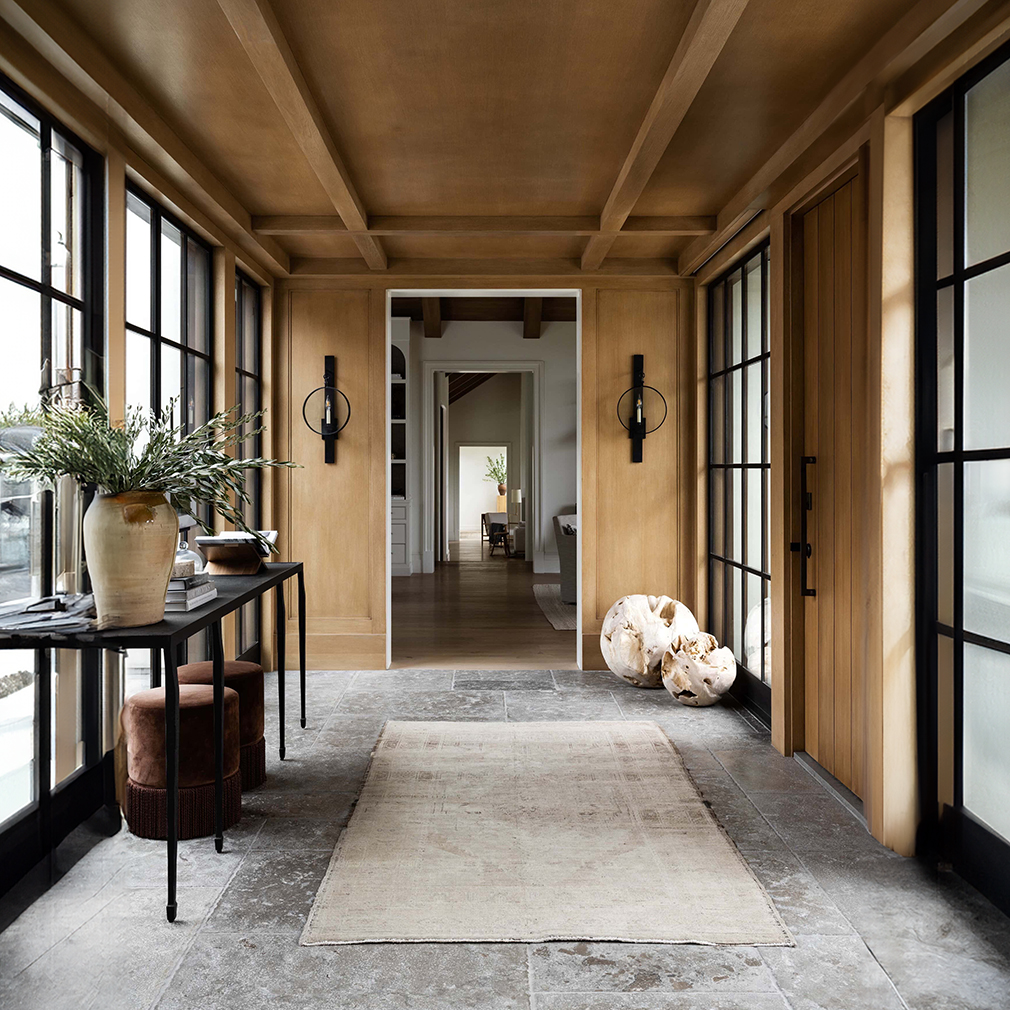
Give it some time, live in the home if you can, and watch how the sunlight and shadows move throughout it. One of my favorite moments is a stunning hallway in our Hilltop Estate project. There’s a beautiful vintage runner underfoot and a pedestal at the end. Other than that, the sunlight does the design.


