


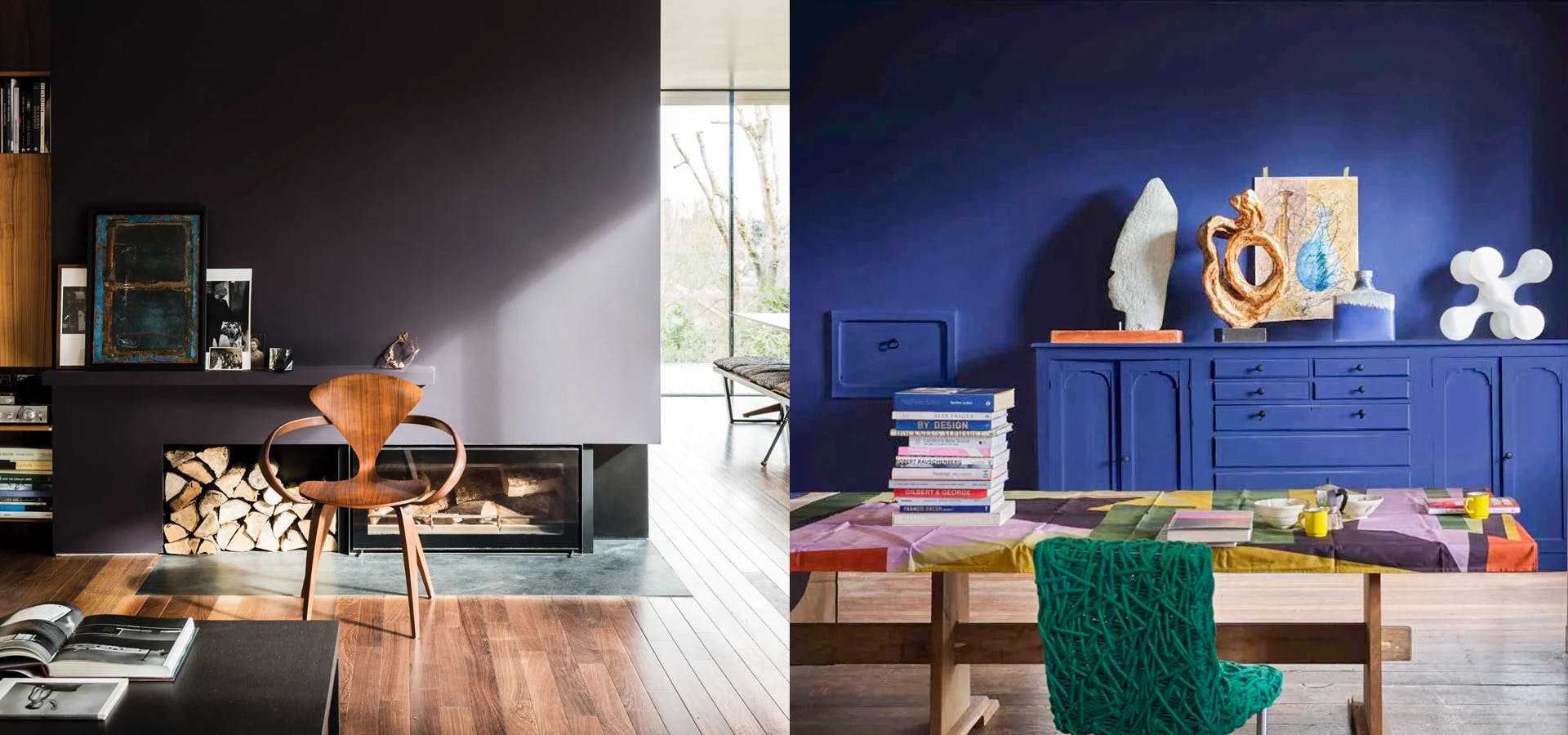
After years of extremely neutral homes and so, so many white walls, the tides are finally turning when it comes to incorporating vibrant colors into the home space. While we will always love a bold bright or a peaceful pastel, 2024’s color vibes are all about that deep, dramatic jewel tone.
When considering a jewel tone for your walls, make sure to think through the effect your finish will give the look. A higher gloss may pump up the glam factor of this look, but it may be too much for some spaces, especially in larger rooms. Conversely, a super-matte finish – like Farrow & Ball’s Dead Flat – can make the color feel even richer and more opulent. To dip your toe into this trend, try painting a smaller space (such as a bathroom or office) your favorite jewel tone, or even paint a piece of furniture to get the look without the full commitment.
From rich amethyst to vivid emerald, there’s a jewel tone for everyone. Here are a few of our favorite gem-inspired paint hues to get this look on your own walls.
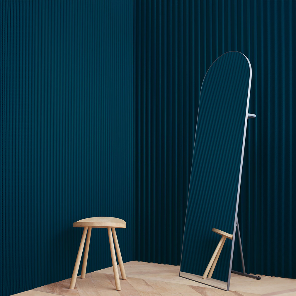
SAPPHIRE
Regal yet calming, a deep blue sapphire blue wall can give your space a presence that’s as dramatic as it is serene. It pairs perfectly with metallic design accents. For a gem-like blue that leans more teal or green, try Benjamin Moore Hidden Sapphire; for a deep, rich blue that’s cool and a bit more purple, try Valspar Sapphire Earrings.
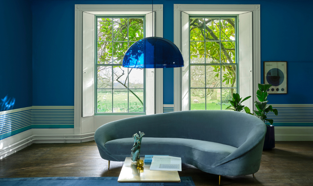
Two more great choices? Try color-drenching a room with Farrow & Ball’s gorgeous Blue Maize, or take a slightly more subtle approach with the brand’s Pea Flower Tea, a deep azure blue that looks beautiful paired with clean white trim in a dining room or living room.
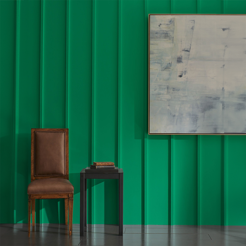
EMERALD
Rich green hits that balance between the glam of the gem that inspired it but infused with a slightly more earthy feel that’s reminiscent of dark green leaves. Let it sing alone or pair it with neutral hues; it’s a surprisingly versatile shade. This color looks amazing with brass or gold accents and gorgeously grained woods like walnut or light oaks for a touch of warmth.
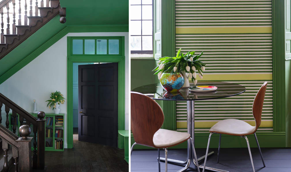
We love the deep, vibrant green of Benjamin Moore Emerald Isle or the cooler, more blue Benjamin Moore Beau Green; for a true green that feels straight out of the undergrowth, try Sherwin Williams Shamrock or Farrow & Ball’s Raw Tomatillo. “Sitting halfway between emerald and peridot, this vibrant green looks absolutely stunning on kitchen cabinetry, especially when paired with an empathetic white such as James White on walls and trim,” says Patrick O’Donnell, Farrow & Ball Global Brand Ambassador.
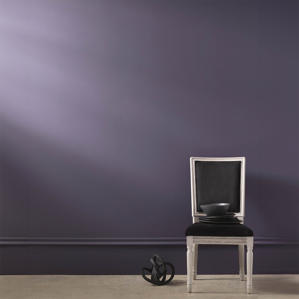
AMETHYST
Drenching your walls with a coat of super-luxe amethyst can create an incredibly cozy and intimate mood, even in larger spaces like bedrooms or living spaces. If you want maximum drama, go with a purple so deep it’s almost black, like Farrow & Ball’s Paean Black or the lush Pelt. A more subtle take on this rich hue is Benjamin Moore Shadow, which has a slight gray undertone that softens it up a bit.
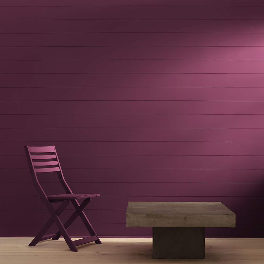
RUBY
If you’re wary of using an intense red on your home’s walls, try going for a deeper burgundy or maroon instead. It’ll feel more luxurious and a bit less brash than a true red. (But hey—it’s your home, so do what you love!) Great deep ruby hues that feel gem-like include Sherwin Williams Framboise and the magenta-infused Benjamin Moore Dark Burgundy.
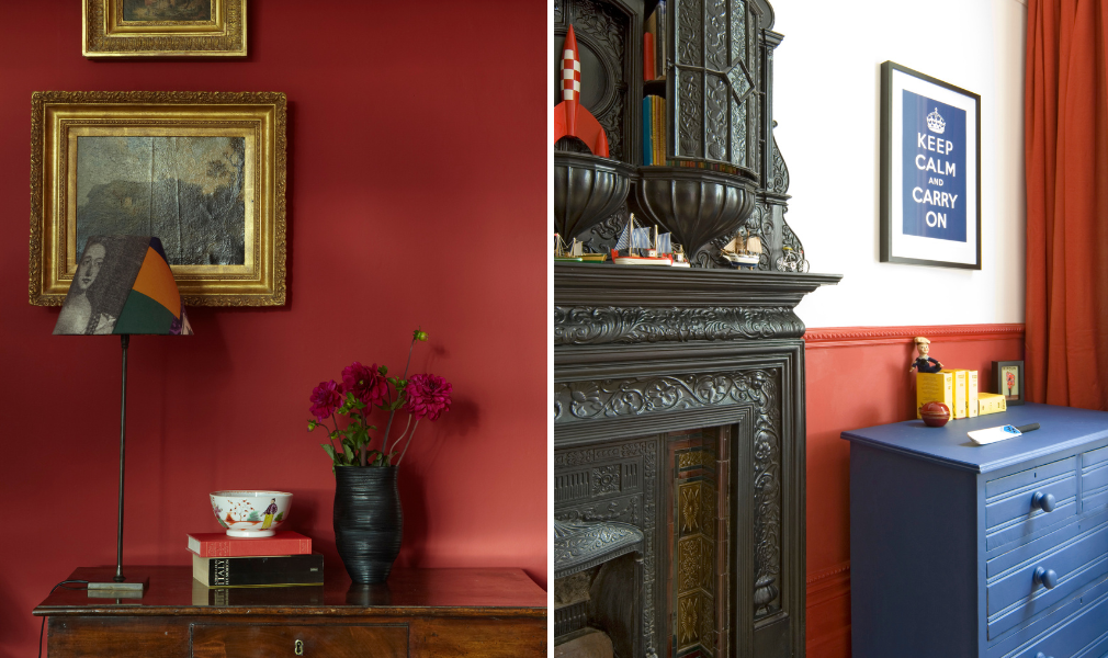
GARNET
Not afraid of a red room? Incarnadine from Farrow & Ball might just be for you. “This rich red with no blue through would look lovely in a reading room or library, especially using the color-drenching technique of applying one color in different finishes all over, like Modern Eggshell on trim and Dead Flat on walls,” O’Donnell says. “Using this technique, you can create lovely contrasts with a finish that looks highly sophisticated and creates a perfectly cocooning environment.”


